- Notice:Make sure you've tagged the field as an "Interactive field". Refer to Step 2: Salesforce Interactive Fields
Set Properties to Interactive Data-Tags
In the Designer, you can edit the properties of the Interactive Action Elements you added to the Form. You can for example change the alignment or direction of text as well as font type or size. You can also add scripts that change are user-trigger by a specific event such as Mouse Enter / Mouse Exit.
To edit an Action Element:
1. In the Form Data Tags pane, right-click the Action Element you want to edit and select Properties; the Properties window is displayed.
2. Perform the required editing in any of the three tabs, and click Save to save your changes.
Options View
Options view displays specific characteristics of the Action type.
See:
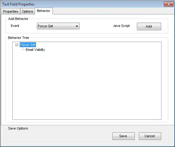
JavaScript Editor – Behavior View
The Behavior view comprises of the following areas:
Add Behavior – Enables creating scripts that are user-triggered by a selected event.
Working with the JavaScript option requires knowledge of JavaScript programming
Behavior Tree – Displays the event-driven scripts defined for this Action Element.
To add a new script:
1. From the Event dropdown list select the event that will trigger the script:
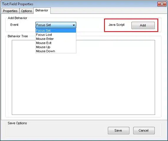
- Notice: For Forms designed for HTML output, do not use the Focus Set or Focus Lost options.
- Focus Set – An element is currently selected to receive input.
- Focus Lost – An element is not selected to receive input (blur).
- Mouse Enter – The mouse pointer enters a selected element.
- Mouse Exit – The mouse pointer exits a selected element.
- Mouse Down – Left mouse button is pressed.
- Mouse Up – Left mouse button is released after being pressed.
2. Click Add next to Java Script; The JavaScript Editor window appears.
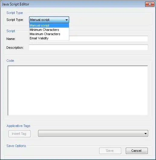
3. In the JavaScript Editor window, select Manual Script, enter the script name and required code (you can also insert tags from the data Model).
4. Click Save to save the script; the new script appears in the Behavior Tree.
To delete a script, right-click a script in the Behavior Tree and select Delete.
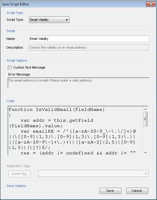
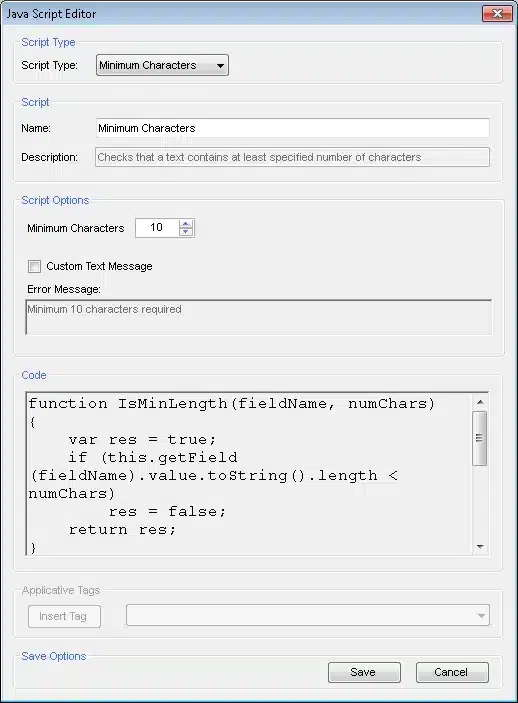
For Text Fields you can also use one of the available predefined scripts:
– Email Validity: checks the validity of an email address.
– Maximum Characters: checks that a text does not contain more than a specified number of characters.
– Minimum Characters: checks that a text contains at least a specified number of characters.
Editing Text Options
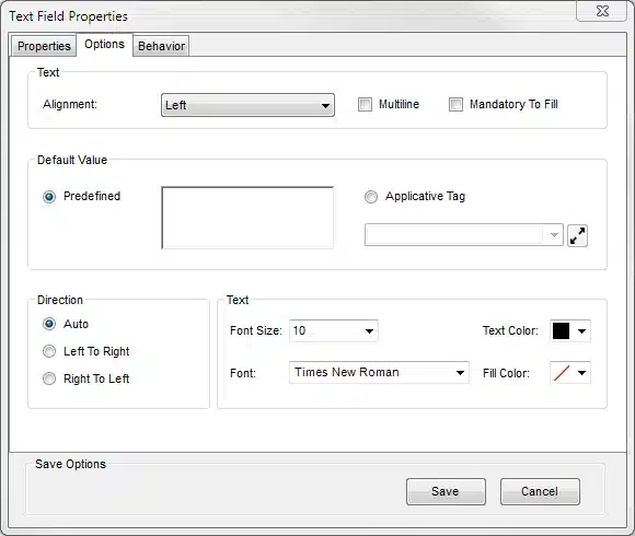
The Options view comprises the following elements:
Alignment – Align the text according to the following options:
- Left
- Center
- Right
Mandatory to Fill – Check this box for the field to be mandatory. If users submit the Form without filling the mandatory field, a red frame appears around the textbox and the Form cannot be submitted.
Default Value
- Predefined – User-generated default value. When selected, enter a default value into the empty field on the right side of the panel.
- Applicative Tag – Default value based on the applicative tags existing in the repository. When selected, the dropdown box is enabled and you can select an Applicative Tag as a default value.
Direction – Direction of the printed text. Select from the following options:
- Auto – Text direction, as defined by the Designer.
- Left To Right – Text printing begins on the left and moves to the right.
- Right To Left – Text printing begins on the right and moves to the left.
Text
- Font Size – Same font sizes as provided by MS Word.
- Font – Only the following 2-byte fonts appear in the font list: Arial, Courier New, Lucida Sans Unicode, Microsoft Sans Serif, Tahoma, Times New Roman
- Text Color – Supported text colors: black, blue, cyan, dark gray, gray, green, light gray, magenta, orange, pink, red, white, yellow.
- Fill Color (Background) – Supported text colors: black, blue, cyan, dark gray, gray, green, light gray, magenta, orange, pink, red, white, yellow.
To add an Email Validation script:
1. From the Script Type dropdown list select Email Validity.
2. You can rename the script.
3. You can check Custom Text Message to change the default message that appears if the email is not validated.
4. Click Save; the New Text Field screen reappears and the Script appears in the Behavior Tree.
To add Maximum Characters validation script:
1. From the Script Type dropdown list select Maximum Characters.
2. You can rename the script.
3. From the Maximum Characters spin-box select the maximum number of characters allowed.
4. You can check Custom Text Message to change the default message that appears if the maximum allowed number of characters has been exceeded.
5. Click Save; the New Text Field screen reappears and the Script appears in the Behavior Tree.

To add Minimum Characters validation script:
1. From the Script Type dropdown list select Minimum Characters.
2. You can rename the script.
3. From the Minimum Characters spin-box select the minimum number of characters allowed.
4. You can check Custom Text Message to change the default message that appears if the minimum required number of characters has not been reached.
5. Click Save; the New Text Field screen reappears and the Script appears in the Behavior Tree.
Editing Checkbox Options
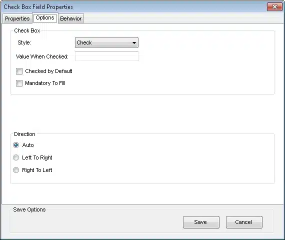
The Check Box option enables you to edit checkboxes you inserted into a Form
The Options view comprises the following elements:
Check Box:
- Style – The type of the indicator within a selected check box. Select one of the options:
– Check
– Circle
– Cross
– Diamond
– Square
– Star - Value When Checked – Default value when the check box is selected.
- Checked by Default – When checked, the check box always first appears in the “Selected” state.
- Mandatory to Fill – When checked, the check box is mandatory (for example agree to Terms and Conditions).
Direction – Direction of the printed text. Select from the following options:
- Auto – Text direction, as defined by the designer.
- Left To Right – Check box name is printed from left to right.
- Right To Left – Check box name is printed from right to left.
Editing Radio Button Options
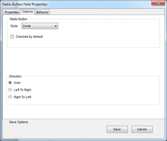
The Radio Button option enables you to edit radio buttons, whereby only one button in the group can be selected at any one time.
The Options view comprises the following elements:
Style – The type of the indicator within a selected check box. Select one of the options:
- Check
- Circle
- Cross
- Diamond
- Square
- Star
Checked by Default – When selected, the radio button always first appears in the “Selected” state.
Tip: It is recommended that one (and only one) of the radio buttons in the Radio Button group is selected by default.
Direction – Direction of the printed text. Select from the following options:
- Auto – Text direction, as defined by the designer.
- Left To Right – Check box name is printed from left to right.
- Right To Left – Check box name is printed from right to left
Editing Picklist Options
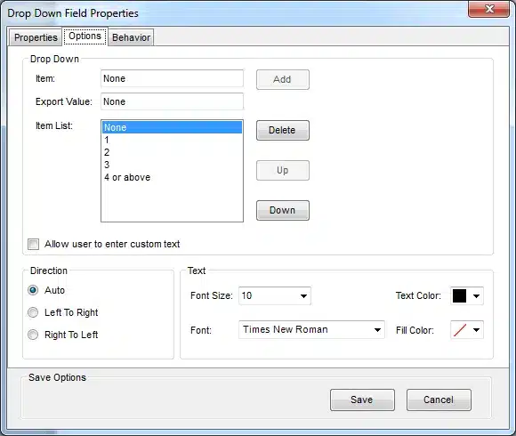
The Drop Down Field option enables you to edit picklists.
The Options view comprises the following elements:
Drop Down
- Item – Enables entering discrete, standalone items into the Drop Down list. When entering text into the field, the Add button is enabled. When you click Add, the item appears in the Item List.
- Export Value – Letter, number, or symbol that represents the value of a specific Item, when the Item List is exported out of the system.
Note: The Export Value is not a required option and the Export Values do not appear in the Item List.
- Item List – List of all of the items entered. Items can be deleted from the list and moved up and down in the hierarchy.
- Allow user to enter custom text – When selected, the custom option will appear in the interface
Direction – Direction of the printed text. Select from the following options:
- Auto – Text direction, as defined by the Designer.
- Left To Right – Drop Down name and list items are printed from left to right.
- Right To Left – Drop Down name and list item are printed from right to left.
Text
- Font Size – Same font sizes as provided by MS Word.
- Font – Only the following 2-byte fonts appear in the font list: Arial, Courier New, Lucida Sans Unicode, Microsoft Sans Serif, Tahoma, Times New Roman
- Text Color – Supported text colors: black, blue, cyan, dark gray, gray, green, light gray, magenta, orange, pink, red, white, yellow.
- Fill Color – Supported fill colors: black, blue, cyan, dark gray, gray, green, light gray, magenta, orange, pink, red, white, yellow.
Editing Multi Picklists Options
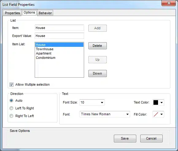
The List Field option enables editing Multi picklists.
The Options view comprises the following elements:
List
- Item – Enables entering discrete, standalone items into the List Field list. When entering text into the field, the Add button is enabled. When you click Add, the item appears in the Item List.
- Export Value – Letter, number, or symbol that represents the value of a specific item, when the Item List is exported out of the system.
Note: The Export Value is not a required option and the Export Values do not appear in the Item List.
- Item List – List of all of the items entered. Items can be deleted from the list and moved up and down in the hierarchy.
- Allow Multiple Selection – When selected, the user can select more than one item from the drop down list.
Direction – Direction of the printed text. Select from the following options:
- Auto – Text direction, as defined by the designer.
- Left To Right – List name and list items are printed from left to right.
- Right To Left – List name and list items are printed from right to left.
Text
- Font Size – Same font sizes as provided by MS Word.
- Font – Only the following 2-byte fonts appear in the font list: Arial, Courier New, Lucida Sans Unicode, Microsoft Sans Serif, Tahoma, Times New Roman
- Text Color – Supported text colors: black, blue, cyan, dark gray, gray, green, light gray, magenta, orange, pink, red, white, yellow.
- Fill Color – Supported fill colors: black, blue, cyan, dark gray, gray, green, light gray, magenta, orange, pink, red, white, yellow.
Editing Submit Button Options
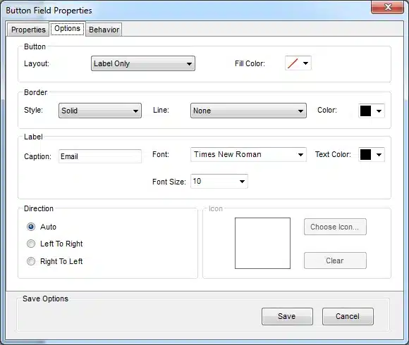
The Button Field Properties window enables editing the Submit button.
Button:
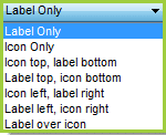
- Layout: From the Layout dropdown list select the layout for the label. If you choose to use an icon, you will also need to select an icon.

- Fill color: Choose one of the available fill colors or no fill.
Border: Select the Style, Line (line thickness) and Color for the border of the Submit
Label
- Caption: Enter the text for the label.
- Font Size – Same font sizes as provided by MS Word.
- Font – Only the following 2-byte fonts appear in the font list: Arial, Courier New, Lucida Sans Unicode, Microsoft Sans Serif, Tahoma, Times New Roman
- Text Color – Supported text colors: black, blue, cyan, dark gray, gray, green, light gray, magenta, orange, pink, red, white, yellow.
Direction – Direction of the label. Select from the following options:
- Auto – Text direction, as defined by the Designer.
- Left To Right – Text printing begins on the left and moves to the right.
- Right To Left – Text printing begins on the right and moves to the left.
Icon:
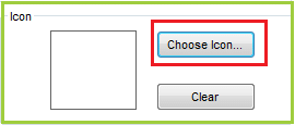
If you choose to use an icon in the Layout, you need to select the icon.
In the Icon area, click Choose Icon.., browse to the icon you require and click Open; the icon you selected appears in the area.
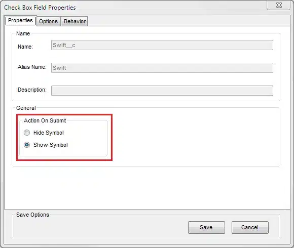
Properties View
The Properties view displays the basic properties of the Action Element. It includes the various elements that cannot be edited.
The Action On Submit area is displayed for Radio buttons and Checkboxes. In this area, you can decide to hide or show a button or checkbox in the generated document after submission.